
What’s changing
We’re improving the way data is suggested and how data is selected when creating a chart in Google Sheets. It’s now easier to locate and select the data you need when creating a dashboard over a dataset with slicers, pivot tables, charts, and more.Who’s impacted
End usersWhy you’d use it
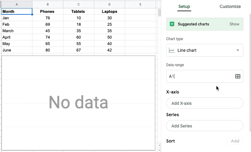
When creating reports in Sheets, it’s common to create multiple charts from the same data table, but using different column ranges. Previously, all data ranges on a table would be used when creating a chart. Now, you’ll be able to select which columns to use for the chart axis and series. This allows you to quickly customize your charts so that they display the most relevant data.Getting started
Admins: There is no admin action required for this feature.End users: This feature will be available by default. In the chart editor, you can select a column as the X-axis and under “Series” you can select additional columns to populate your chart.
Rollout pace
- Rapid Release domains: Gradual rollout (up to 15 days for feature visibility) starting on March 10, 2020.
- Scheduled Release domains: Gradual rollout (up to 15 days for feature visibility) starting on March 30, 2020
Availability
- Available to all G Suite customers and users with personal Google accounts