June 7, 2018
A new look for Google sign-in screens on June 14th
Update (July 10, 2018): This launch has been delayed. Please stay tuned to the G Suite Updates blog for more information, as we'll provide an update on the launch and its timing shortly.
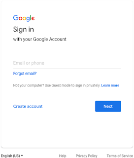
In 2014, we introduced Material Design, a visual language that helps developers create intuitive and beautiful products. Since then, we’ve steadily updated our G Suite apps to adhere to Material principles. Next week, we’ll bring this same design to Google sign-in screens.
Starting on June 14th, 2018, you may notice that when you sign in to your G Suite account, the screen looks slightly different. Some of the changes will include tweaks to the Google logo, an outline around the text field, and center alignment of all items on the screen. See below for before and after images.
If necessary, please provide your users advance notice of these changes.
Launch Details
Release track:
Launching to both Rapid Release and Scheduled Release on June 14th, 2018
Editions:
Available to all G Suite editions
Rollout pace:
Gradual rollout (up to 15 days for feature visibility)
Impact:
All end users
Action:
Change management suggested/FYI
Launch release calendar
Launch detail categories
Get these product update alerts by email
Subscribe to the RSS feed of these updates


