March 6, 2023
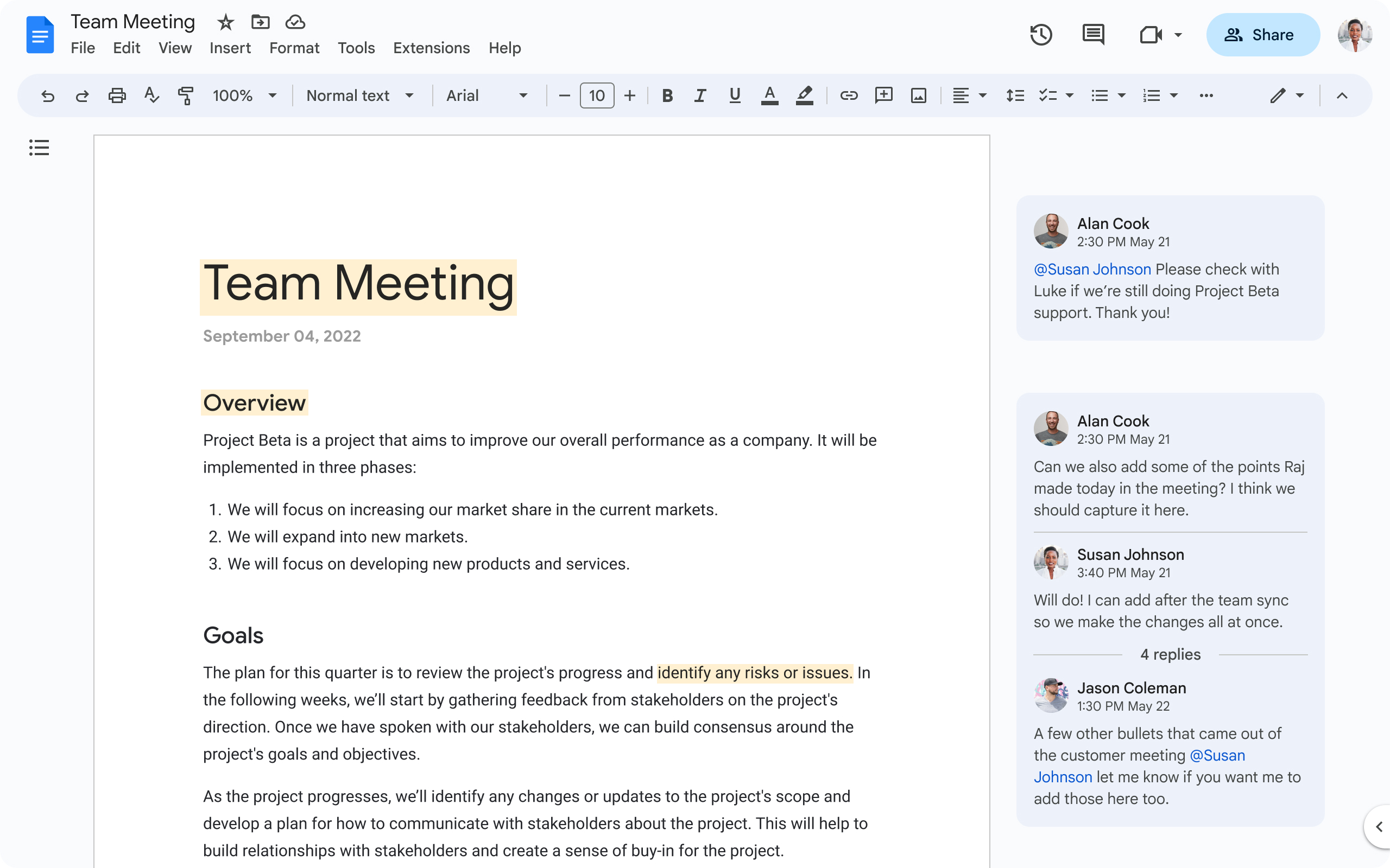
Refreshed interface for Google Drive, Google Docs, Google Sheets, and Google Slides
What’s changing
- A simplified user interface at the top of your docs, sheets, and slides, helping you find frequently used actions faster
- Additional user experience improvements in commenting, background, rulers, and gridlines.
- Note that while there are no changes in functionality, some features have been relocated to reduce clutter within the new interface. Notably, you can find the latest status info for the doc, such as last edit and version history, via a single entry point: the clock icon in the top right corner.
- Key actions surfaced inline on files, for quick access and increased productivity.
- Ability to select multiple items at a time and undertake batch operations for frequent tasks.
- New search chips (including type, owner, and last modified) to help you find files faster.
Who’s impacted
Why it matters
Rollout pace
- Rapid Release domains: Gradual rollout (up to 15 days for feature visibility) starting on March 6, 2023
- Scheduled Release domains: Full rollout (1–3 days for feature visibility) starting on March 22, 2023
Availability
- Available to all Google Workspace customers, as well as legacy G Suite Basic and Business customers
- Available to users with personal Google accounts


.gif)